How can we better visualize sea-level rise data?
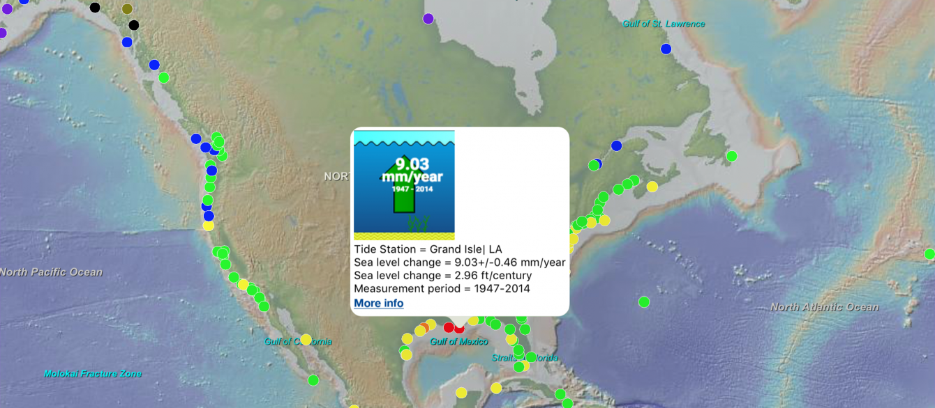
The amount of data surrounding climate change can be daunting and difficult to parse. Columbia researchers have designed an app that makes sea-level rise data accessible and easier to understand.
Polar Explorer: Sea Level pulls data from the National Oceanic and Atmospheric Administration (NOAA) and NASA to create interactive maps that prompt the exploration of questions related to changing sea levels and climate vulnerability. The app is based around seven “big question” categories, including “What is sea level?” and “What are future predictions for the US coast?”
Users can choose from a selection of map layers to visualize the effects of sea-level rise. For example, a user who wants to know where sea level is changing right now can choose to display a map showing tide stations around the world, regional trends in sea level, or regions vulnerable to future coastal flooding. Learn more.
Make Your Commitment Today
Ideas and Impact